Layout and Styling of Jupyter widgets
This notebook presents how to layout and style Jupyter interactive widgets to build rich and reactive widget-based applications.
The layout attribute.
Every Jupyter interactive widget has a layout attribute exposing a
number of CSS properties that impact how widgets are laid out.
Exposed CSS properties
The following properties map to the values of the CSS properties of the same name (underscores being replaced with dashes), applied to the top DOM elements of the corresponding widget.
** Sizes ** - height - width - max_height -
max_width - min_height - min_width
** Display **
visibilitydisplayoverflowoverflow_xoverflow_y
** Box model ** - border - margin - padding
** Positioning ** - top - left - bottom - right
** Flexbox ** - order - flex_flow - align_items -
flex - align_self - align_content - justify_content
Shorthand CSS properties
You may have noticed that certain CSS properties such as
margin-[top/right/bottom/left] seem to be missing. The same holds
for padding-[top/right/bottom/left] etc.
In fact, you can atomically specify [top/right/bottom/left] margins
via the margin attribute alone by passing the string
margin: 100px 150px 100px 80px;
for a respectively top, right, bottom and left margins
of 100, 150, 100 and 80 pixels.
Similarly, the flex attribute can hold values for flex-grow,
flex-shrink and flex-basis. The border attribute is a
shorthand property for border-width, border-style (required),
and border-color.
Simple examples
The following example shows how to resize a Button so that its views
have a height of 80px and a width of 50% of the available space:
In [1]:
from ipywidgets import Button, Layout

b = Button(description='(50% width, 80px height) button',
           layout=Layout(width='50%', height='80px'))
b
The layout property can be shared between multiple widgets and
assigned directly.
In [2]:
Button(description='Another button with the same layout', layout=b.layout)
Description
You may have noticed that the widget’s length is shorter in presence of
a description. This because the description is added inside of the
widget’s total length. You cannot change the width of the internal
description field. If you need more flexibility to layout widgets and
captions, you should use a combination with the Label widgets
arranged in a layout.
In [3]:
from ipywidgets import HBox, Label, IntSlider

HBox([Label('A too long description'), IntSlider()])
More Styling (colors, inner-widget details)
The layout attribute only exposes layout-related CSS properties for
the top-level DOM element of widgets. Individual widgets may expose more
styling-related properties, or none. For example, the Button widget
has a button_style attribute that may take 5 different values:
'primary''success''info''warning''danger'
besides the default empty string ‘’.
In [4]:
from ipywidgets import Button

Button(description='Danger Button', button_style='danger')
Natural sizes, and arrangements using HBox and VBox
Most of the core-widgets have - a natural width that is a multiple of
148 pixels - a natural height of 32 pixels or a multiple of that
number. - a default margin of 2 pixels
which will be the ones used when it is not specified in the layout
attribute.
This allows simple layouts based on the HBox and VBox helper
functions to align naturally:
In [5]:
from ipywidgets import Button, HBox, VBox

words = ['correct', 'horse', 'battery', 'staple']
items = [Button(description=w) for w in words]

HBox([VBox([items[0], items[1]]), VBox([items[2], items[3]])])
Latex
Widgets such as sliders and text inputs have a description attribute
that can render Latex Equations. The Label widget also renders Latex
equations.
In [6]:
from ipywidgets import IntSlider, Label
In [7]:
IntSlider(description='$\int_0^t f$')
In [8]:
Label(value='$e=mc^2$')
Number formatting
Sliders have a readout field which can be formatted using Python’s `Format Specification Mini-Language <https://docs.python.org/3/library/string.html#format-specification-mini-language>`__. If the space available for the readout is too narrow for the string representation of the slider value, a different styling is applied to show that not all digits are visible.
The Flexbox layout
In fact, the HBox and VBox helpers used above are functions
returning instances of the Box widget with specific options.
The Box widgets enables the entire CSS Flexbox spec, enabling rich
reactive layouts in the Jupyter notebook. It aims at providing an
efficient way to lay out, align and distribute space among items in a
container.
Again, the whole Flexbox spec is exposed via the layout attribute of
the container widget (Box) and the contained items. One may share
the same layout attribute among all the contained items.
Acknowledgement
The following tutorial on the Flexbox layout follows the lines of the article `A Complete Guide to Flexbox <https://css-tricks.com/snippets/css/a-guide-to-flexbox/>`__ by Chris Coyier.
Basics and terminology
Since flexbox is a whole module and not a single property, it involves a lot of things including its whole set of properties. Some of them are meant to be set on the container (parent element, known as “flex container”) whereas the others are meant to be set on the children (said “flex items”).
If regular layout is based on both block and inline flow directions, the flex layout is based on “flex-flow directions”. Please have a look at this figure from the specification, explaining the main idea behind the flex layout.
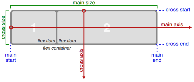
Flexbox
Basically, items will be laid out following either the main axis
(from main-start to main-end) or the cross axis (from
cross-start to cross-end).
main axis- The main axis of a flex container is the primary axis along which flex items are laid out. Beware, it is not necessarily horizontal; it depends on the flex-direction property (see below).main-start | main-end- The flex items are placed within the container starting from main-start and going to main-end.main size- A flex item’s width or height, whichever is in the main dimension, is the item’s main size. The flex item’s main size property is either the ‘width’ or ‘height’ property, whichever is in the main dimension. cross axis - The axis perpendicular to the main axis is called the cross axis. Its direction depends on the main axis direction.cross-start | cross-end- Flex lines are filled with items and placed into the container starting on the cross-start side of the flex container and going toward the cross-end side.cross size- The width or height of a flex item, whichever is in the cross dimension, is the item’s cross size. The cross size property is whichever of ‘width’ or ‘height’ that is in the cross dimension.
Properties of the parent

Container
display(must be equal to ‘flex’ or ‘inline-flex’)
This defines a flex container (inline or block). - flex-flow
(shorthand for two properties)
This is a shorthand flex-direction and flex-wrap properties,
which together define the flex container’s main and cross axes. Default
is row nowrap.
- `flex-direction` (row | row-reverse | column | column-reverse)
This establishes the main-axis, thus defining the direction flex items are placed in the flex container. Flexbox is (aside from optional wrapping) a single-direction layout concept. Think of flex items as primarily laying out either in horizontal rows or vertical columns.

- `flex-wrap` (nowrap | wrap | wrap-reverse)
By default, flex items will all try to fit onto one line. You can change that and allow the items to wrap as needed with this property. Direction also plays a role here, determining the direction new lines are stacked in.

justify-content(flex-start | flex-end | center | space-between | space-around)
This defines the alignment along the main axis. It helps distribute
extra free space left over when either all the flex items on a line are
inflexible, or are flexible but have reached their maximum size. It also
exerts some control over the alignment of items when they overflow the
line. 
align-items(flex-start | flex-end | center | baseline | stretch)
This defines the default behaviour for how flex items are laid out along
the cross axis on the current line. Think of it as the justify-content
version for the cross-axis (perpendicular to the main-axis). 
align-content(flex-start | flex-end | center | baseline | stretch)
This aligns a flex container’s lines within when there is extra space in
the cross-axis, similar to how justify-content aligns individual items
within the main-axis.
Note: this property has no effect when there is only one line of flex items.
Properties of the items

Item
The flexbox-related CSS properties of the items have no impact if the
parent element is not a flexbox container (i.e. has a display
attribute equal to flex or inline-flex).
order
By default, flex items are laid out in the source order. However, the order property controls the order in which they appear in the flex container.
flex(shorthand for three properties) This is the shorthand for flex-grow, flex-shrink and flex-basis combined. The second and third parameters (flex-shrink and flex-basis) are optional. Default is0 1 auto.flex-grow
This defines the ability for a flex item to grow if necessary. It accepts a unitless value that serves as a proportion. It dictates what amount of the available space inside the flex container the item should take up.
If all items have flex-grow set to 1, the remaining space in the container will be distributed equally to all children. If one of the children a value of 2, the remaining space would take up twice as much space as the others (or it will try to, at least).

flex-shrink
This defines the ability for a flex item to shrink if necessary.
flex-basis
This defines the default size of an element before the remaining space is distributed. It can be a length (e.g.
20%,5rem, etc.) or a keyword. Theautokeyword means “look at my width or height property”.align-self
This allows the default alignment (or the one specified by align-items) to be overridden for individual flex items.

Align
The VBox and HBox helpers
The VBox and HBox helper provide simple defaults to arrange
child widgets in Vertical and Horizontal boxes.
def VBox(*pargs, **kwargs):
    """Displays multiple widgets vertically using the flexible box model."""
    box = Box(*pargs, **kwargs)
    box.layout.display = 'flex'
    box.layout.flex_flow = 'column'
    box.layout.align_items = 'stretch'
    return box

def HBox(*pargs, **kwargs):
    """Displays multiple widgets horizontally using the flexible box model."""
    box = Box(*pargs, **kwargs)
    box.layout.display = 'flex'
    box.layout.align_items = 'stretch'
    return box
Examples
Four buttons in a ``VBox``. Items stretch to the maximum width, in a vertical box taking ``50%`` of the available space.
In [9]:
from ipywidgets import Layout, Button, Box

items_layout = Layout(flex='1 1 auto',
                      width='auto')     # override the default width of the button to 'auto' to let the button grow

box_layout = Layout(display='flex',
                    flex_flow='column',
                    align_items='stretch',
                    border='solid',
                    width='50%')

words = ['correct', 'horse', 'battery', 'staple']
items = [Button(description=w, layout=items_layout, button_style='danger') for w in words]
box = Box(children=items, layout=box_layout)
box
Three buttons in an HBox. Items flex proportionaly to their weight.
In [10]:
from ipywidgets import Layout, Button, Box

items_layout = Layout(flex='1 1 auto', width='auto')     # override the default width of the button to 'auto' to let the button grow

items = [
    Button(description='weight=1'),
    Button(description='weight=2', layout=Layout(flex='2 1 auto', width='auto')),
    Button(description='weight=1'),
 ]

box_layout = Layout(display='flex',
                    flex_flow='row',
                    align_items='stretch',
                    border='solid',
                    width='50%')
box = Box(children=items, layout=box_layout)
box
A more advanced example: a reactive form.
The form is a VBox of width ‘50%’. Each row in the VBox is an HBox,
that justifies the content with space between..
In [11]:
from ipywidgets import Layout, Button, Box, FloatText, Textarea, Dropdown, Label, IntSlider

label_layout = Layout()

form_item_layout = Layout(
    display='flex',
    flex_flow='row',
    justify_content='space-between'
)

form_items = [
    Box([Label(value='Age of the captain'), IntSlider(min=40, max=60)], layout=form_item_layout),
    Box([Label(value='Egg style'),
         Dropdown(options=['Scrambled', 'Sunny side up', 'Over easy'])], layout=form_item_layout),
    Box([Label(value='Ship size'),
         FloatText()], layout=form_item_layout),
    Box([Label(value='Information'),
         Textarea()], layout=form_item_layout)
]

form = Box(form_items, layout=Layout(
    display='flex',
    flex_flow='column',
    border='solid 2px',
    align_items='stretch',
    width='50%'
))
form
A more advanced example: a carousel.
In [12]:
from ipywidgets import Layout, Button, Box

item_layout = Layout(height='100px', min_width='40px')
items = [Button(layout=item_layout, button_style='warning') for i in range(40)]
box_layout = Layout(overflow_x='scroll',
                    border='3px solid black',
                    width='500px',
                    height='',
                    flex_direction='row',
                    display='flex')
carousel = Box(children=items, layout=box_layout)
carousel